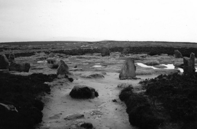
I created the digipak's designs with the same idea that I'd had with the magazine ad, and that was to create a recurring theme through all three media texts. The main idea I wanted is that of the location and surrounding area that we shot; this involves Ilkley moor, stills from the wood where we shot our video and other varying areas of greenery. Our original plan was to shoot at the 12 Apostles on Ilkley Moor, but this soon became problematic as we could not get the equipment up there, especially in the snowy conditions we had.
Still, we used an image of the 12 apostles anyway because of the foreboding and isolated appearance of it, and also due to the aspect of intertextuality it had with Stonehenge, i.e the Spinal Tap-esque feel, but not as tongue-in-cheek.We used quite a lot of pictures from this area, and used Adobe Photoshop to edit them subtly, I decided to go with black and white undertone.
Another shot we used, for the back panel.
 |
| This is the front cover; featuring a forest canopy, edited with instagram. |
 |
| The 12 apostles credits section background. |
No comments:
Post a Comment
make sure comments are appropriate. Comments are moderated, so no trollin bro!